As an Amazon Associate, we earn from qualifying purchases. Some links on this site are affiliate links at no extra cost to you. Our recommendations are based on thorough research and editorial judgment.
What Makes a Great Coffee Table Book: Layout, Paper, and Photography Explained
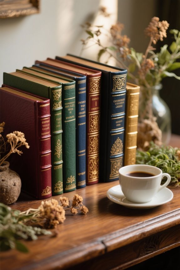
A great coffee table book features an engaging layout, high-quality photography, and premium paper, ideally glossy for vibrant images or matte for a refined touch. Elements like thoughtful typography and a cohesive color palette enhance visual storytelling and reader engagement. Expect a well-balanced mixture of striking visuals and concise text, often seen in publications like “Humans of New York” or “The Art of the Beatles.” Discovering what truly elevates a coffee table book can reveal new insights!
Key Takeaways
- Effective layout design combines visual elements, whitespace, and consistent typography to enhance reader engagement and storytelling.
- High-quality photography using professional equipment, optimal lighting, and thoughtful composition elevates the visual appeal of a coffee table book.
- Paper selection is crucial; glossy finishes enhance vibrancy, while matte surfaces suit text-heavy layouts and black-and-white images.
- A cohesive color palette and consistent typography throughout the book create visual harmony and boost reader engagement.
- Engaging captions and informative text deepen the connection between images and storytelling, enriching the overall reader experience.
The Importance of Layout in Coffee Table Books
You may be interested


The allure of a coffee table book often lies not just in its content but in its design; layout serves as the foundation upon which visual storytelling is built. A well-crafted layout greatly enhances visual appeal and reader engagement, keeping attention longer and often boosting sales. Effective use of whitespace, allowing images and text to breathe, creates an immersive experience (because who doesn’t love an uncluttered page?). Consistent typography and alignment enhance professionalism, while choosing between landscape or portrait formats can elevate image quality, especially in photography-heavy books. Thoughtful chapter breaks and running headers promote easy navigation, making the overall reading journey more enjoyable. When done right, layout transforms ordinary hardcover books into enchanting experiences worth displaying! Coffee table books can also serve dual functionality, acting as both decorative elements and practical storage solutions, thus enhancing the utility of living spaces.
Recommended Products

Excellent Comfort - Caberryne recliner sectional sofa is upholstered in high-resistance corduroy that can resist daily wear, and fading, maintaining its look for years. Pillow armrests, thick backrests and full cushions are ensuring the best comfort.

Unmatched Elegance in Every Cowhide: Add a touch of rustic charm with our white brown and black area rug. Featuring a unique blend of dark, rich tones and patterns, our cow skin rug brings a sophisticated visual interest to any space.

Luxurious Comfort: The 0.25" low-pile design offers the ideal balance of softness and practicality. It fits easily under doors or furniture without obstructing movement. The fuzzy faux wool feels gentle on bare feet, softening hard floors and creating a relaxing oasis in your home
Elements of Effective Visual Composition

Creating an enchanting coffee table book goes beyond mere aesthetics; the art of visual composition plays a pivotal role in resonating with the audience. An effective layout design incorporates alignment, balance, and strong visual elements, crafting an engaging narrative that captivates readers. High-quality photographs paired with strategically placed whitespace can enhance visual impact, making the content feel inviting. Typography plays an essential role in maintaining coherence throughout the book, further elevating its quality. Consistent use of color schemes unifies the pages, while logical arrangement of imagery directs focus and fosters emotional connections. By combining these elements thoughtfully, coffee table books not only catch the eye but also enhance reader attention, ultimately leading to increased sales and satisfaction! Coastal decor books often include practical advice on using natural materials and light color palettes, enhancing both visual appeal and thematic consistency.
Typography Choices and Their Impact
When it comes to designing a coffee table book, typography choices can make all the difference in engaging readers and enhancing their experience. Thoughtful selection of typeface and size not only impacts readability but also elevates visual appeal, particularly when paired with high-quality imagery. Bold and clear fonts capture attention and become integral components of effective page layouts. Research indicates that proper typography can increase information retention rates by up to 20%, underscoring its vital role. Furthermore, consistent spacing and alignment contribute to coherence, ensuring a seamless reading flow. As a result, these design choices not only beautify pages but also greatly enhance the overall reader experience, making typography a key pillar in coffee table book excellence! Additionally, visual learning aids, such as annotated images and diagrams, play a crucial role in reader engagement, as they make complex concepts more digestible and inspire creativity.
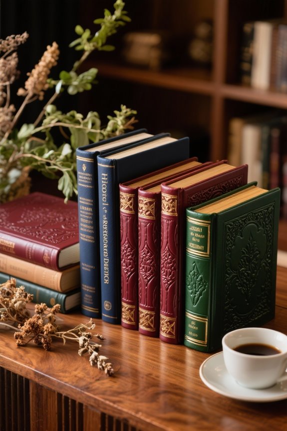
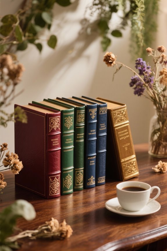
Selecting the Right Color Palette
A thoughtfully chosen color palette holds immense power in shaping the overall ambiance of a coffee table book, with many designers emphasizing its importance for both aesthetic and emotional impact! Selecting the right colors not only enhances the visual narrative, but also invites viewer engagement. Warm hues often evoke comfort, while cooler tones can introduce sophistication. Utilizing a monochromatic scheme boosts cohesion, creating a harmonious experience that captures attention. The choice of vibrant colors can stand out on shelves, appealing to collectors, whereas muted tones suggest elegance in luxury markets. Guided by color theory, strategic color combinations can elevate the design and layout, providing essential aesthetic appeal. When coupled with high-quality paper, a well-selected palette can transform a coffee table book into a coveted item! A thoughtfully curated space benefits from cohesive color palettes that resonate with the overall decor vision, enhancing both aesthetic appeal and emotional connection.
Striking a Balance Between Text and Images
Striking the right balance between text and images can define the success of a coffee table book, as this delicate interplay not only enthralls readers but also enhances the overall storytelling experience! A well-thought-out layout design merges stunning visuals with concise, informative text, shifting away from text-heavy books to more visually driven narratives. High-quality images paired with crafted copy deepen reader engagement, transforming mere collections into immersive experiences. This strategic balance not only enhances visual appeal but also boosts reader interest and retention rates, which can greatly impact sales and recommendations. Publishers like Abrams, with their beautifully curated collections, exemplify this principle, proving that a harmonious blend of text and imagery creates a compelling story that resonates long after the pages are turned! A prime example of this balance can be found in Katy Campbell’s “At Home in the Cotswolds,” which features visually stunning photography that showcases the charm of English homes while providing rich historical insights.
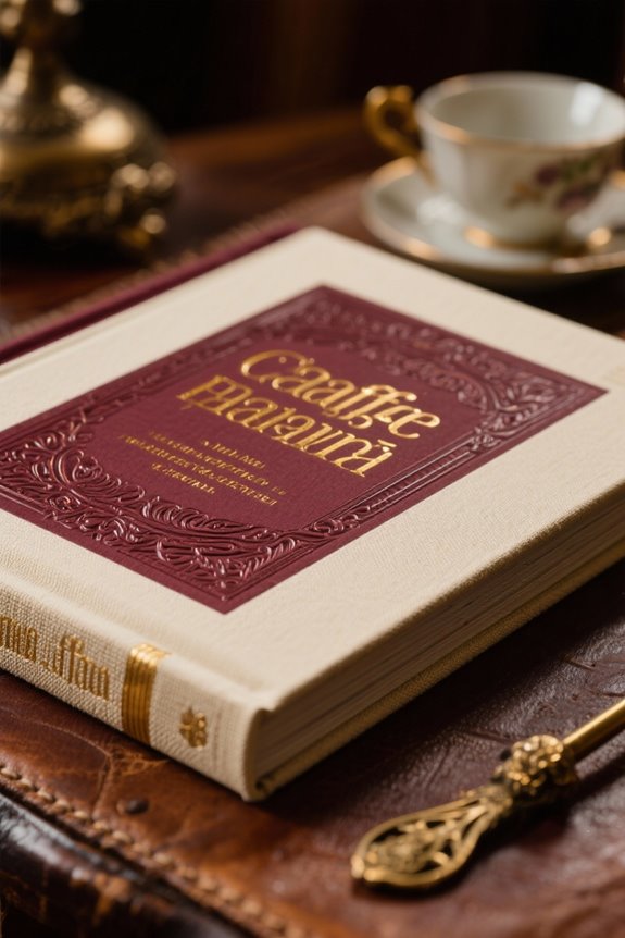
Creating an Engaging Cover Design
While the interior pages of a coffee table book may fascinate with enthralling stories and breathtaking visuals, the cover design stands as the essential first impression that can entice readers before they even reach for the spine. A compelling cover, featuring high-quality images and simplified layout design, markedly enhances the visual appeal, which can increase pick-up rates by up to 50% in bookstores! Currently, trends favor bold designs centered on one or two elements that resonate with modern consumer preferences. Additionally, consistency across the cover, spine, and back guarantees a polished look that accurately reflects the subject matter and content. With an enchanting title and an engaging blurb, readers are irresistibly drawn in—curiosity piqued and excitement brewing! Adding elements of Modern Stoicism in the design can resonate with readers seeking philosophical insights, drawing them in with both aesthetic and intellectual appeal.
Recommended Products

COFFEE TABLE BOOK STACK: Set of 3 realistic 8” x 11” fake books with blank, unlined pages to write in or leave empty. Our large decoration books display beautifully as coffee table décor, office décor, kitchen décor or farmhouse décor for the home.
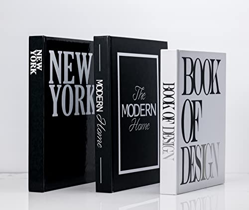
Enhance Neutral Home Decor –These Extra Large Modern decorative books have stunning contrast, design, and colors that evoke a visual interest on a Display Prop, shelf, table, Library, mantle, bookshelf decor, nightstand, bedroom, bookcase, entryway, centerpiece, Modern Home Decor, or tray. The display books are the perfect finishing touch that adds a great accent to any room. This farmhouse table decor also gives life and highlights your office, shelves, living room, desk, countertop, kitchen.

STACKABLE DECORATIVE BOOKS FOR STYLISH SPACES: Turn any space into a curated interior with this set of 3 neutral-toned decorative books. Designed to be stacked or displayed individually, they effortlessly elevate coffee tables, consoles, and shelves with travel-inspired charm.
The Role of Paper Quality in Visual Appeal
When selecting the right paper quality for a coffee table book, it becomes evident that high-grade options can transform the aesthetic experience from ordinary to extraordinary! High-quality print on glossy papers amplifies the visual impact of stunning photographs, bringing colors to life with vibrant clarity. The thickness and opacity of premium paper choices effectively prevent bleed-through, ensuring that every page retains its sharpness. Additionally, eco-friendly paper alternatives are becoming increasingly popular, appealing to environmentally-conscious readers while still exuding a sense of luxury. Remarkably, specialty papers can elevate the perceived value of a book by up to 30%! Ultimately, the right paper quality not only enhances the tactile experience but also markedly boosts reader engagement. Some titles, like “In Love With The Sea,” enhance their appeal through stunning ocean photography and inspirational quotes that resonate with readers. What a delightful combination!
Recommended Products

Versatile function: Compact end table works as a side table, nightstand, or accent piece in living rooms, bedrooms, or offices
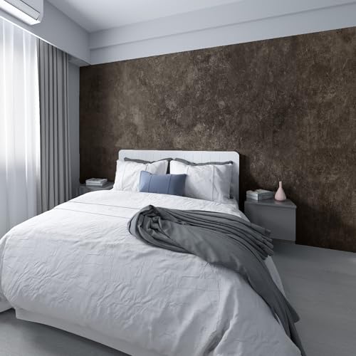
Please watch the product color, details, and size for the actual video. Big Roll; Large Size; Wide; Come with glossy design of the dark brown tan grey cement contact paper, touch well

Wider- Ez Faux Decor vinyl countertop wrap comes in 36” width and then various lengths for a seamless application. The length can vary from 24 inches to 240 inches. The material is self-adhesive peel and stick marble vinyl, and easy to remove.
Types of Paper and Their Effects on Photography
The choice of paper can dramatically influence the visual storytelling within a coffee table book, especially one packed with breathtaking photography! Glossy paper enhances color vibrancy and detail, making images in photography-heavy books appear dynamic and engaging. On the flip side, matte paper offers a sophisticated, glare-free finish that can deepen the effect of black and white or softer images. Premium papers, ranging from 130 to 200 gsm, add a luxurious feel that complements visual quality, while specialty papers, such as metallic options, evoke unique emotions in the presentation of photographs. Additionally, eco-friendly paper choices, like recycled or sustainably sourced materials, cater to a growing audience that values sustainable practices in publishing. The Home Café offers insights into creating café-style beverages at home, adding another layer of personalized creativity to your coffee table book collection. What a fantastic way to make an impact!
Recommended Products

28 lb. Paper, 100 bright with 500 sheets per pack/ 8 reams per case/ 32 cartons per pallet

MADE IN USA - Hammermill copying and printing paper is 100% made in the USA, helping to support 2.4 million sustainable forestry jobs in America, including family tree farmers. Hammermill is more than just paper. See images.

ECO GLOSSY POLYESTER CANVAS FOR DISPLAY OUTPUT Made from ECO polyester material, this glossy canvas roll delivers enhanced color saturation, high contrast and moisture resistance for display graphics and exhibition visuals. Supports aqueous dye and pigment inkjet printing, and is compatible with eco-solvent, latex and UV printing workflows.
Techniques for High-Quality Photography
Exceptional photography techniques are essential for transforming ordinary images into the breathtaking visuals that make coffee table books unforgettable! High-quality photography hinges on using professional-grade cameras and lenses, which drastically enhance image clarity and detail, creating visually compelling content that captivates viewers. Employing effective lighting techniques, whether through natural light or controlled studio setups, can set the mood and elevate the portrayal of subjects, turning the mundane into striking visuals. After capturing images, post-processing in software like Adobe Lightroom or Photoshop brings consistent aesthetics through adjustments in color and contrast. Additionally, mastering composition principles, such as the rule of thirds and leading lines, allows photographers to craft dynamic images that not only engage viewers but also tell an enthralling visual story! Moreover, studying fine art photography books can enhance understanding of artistic expression and provide inspiration through diverse photographic styles and techniques.
Crafting Compelling Captions and Text
Engaging captions and insightful text can truly elevate a coffee table book, offering readers a deeper understanding of the visual storytelling unfolding before them! Crafting captions and text elements is vital to enhance the reading experience, providing context that connects stunning visuals to their stories. Consistency in font size, style, and placement contributes to the visual harmony essential for an appealing layout. Including informative details, such as dates or background stories, deepens emotional connections and enriches the narrative. To maintain a clean design, limiting text to a few font families guarantees that beautiful photography remains the focal point. Thoughtfully crafted captions not only boost memorability but also enhance the overall photography impact, making the book an enduring treasure for its audience! Visual aids, such as pictures and illustrations, improve understanding of concepts and techniques, providing a richer experience for readers.
Ensuring a Cohesive Flow Throughout the Book
Cohesion serves as the backbone of an effective coffee table book, where each element works in harmony to guide readers through a visually engaging journey. A consistent layout, complete with uniform margins, typography, and a cohesive color palette, is essential for narrative continuity. By thoughtfully sequencing images and text, the designer can create a flowing experience that connects themes, while effective use of whitespace allows each element to breathe and shine on its own. High-quality images should shift seamlessly from page to page, evoking an emotional response tied to the book’s overall theme. To further enhance the cohesive flow, the implementation of visual and textual elements—like chapter dividers or recurring motifs—can provide clarity and reinforce unity throughout the book!
Finalizing Design Choices Before Printing
With the design elements harmoniously arranged, it’s now time for the fun part: finalizing design choices before printing! Choosing a cohesive color palette can boost reader engagement by 30%, so selecting colors that enhance the theme is essential. For photography-rich coffee table books, high-quality glossy paper shines, while matte finishes suit text-heavy layouts, affecting both the tactile experience and visual appeal. Ensuring layout consistency with uniform typography and spacing greatly enhances the reading experience. Before printing, always review proofs to assess image quality and layout coherence—it’s a game-changer! Gathering feedback from trusted peers or professionals can elevate aesthetics, ensuring every design choice resonates well. The collaboration often leads to that satisfying “wow” factor, crucial for enthralling readers!
Recommended Products

Many unseen personal photos, illustrations, artist photos, school reports, baby book, rare memorabilia, letters and other fascinating insights.

Used Book in Good Condition

Frequently Asked Questions
What Makes a Great Coffee Table Book?
A great coffee table book unfolds like a vivid tapestry, weaving together visual storytelling and ideal subjects. Harmonious color palettes and image selection create compelling narratives, fostering reader engagement through theme cohesion and artistic presentation.
What Is the 2/3 Rule for Coffee Tables?
The 2/3 rule for coffee tables promotes design aesthetics by ensuring height variation that provides visual balance. It enhances book placement and cohesive styling, allowing personal touches and color contrast to harmonize within the living space.
What Is the Format for a Coffee Table Book?
The format of a coffee table book ironically prioritizes aesthetics over practicality. Effective cover design, diverse content, thoughtful color schemes, and consistent themes combine with appropriate page dimensions and binding techniques to captivate a discerning audience.
How to Design a Coffee Table With Books?
Designing a coffee table involves diverse styles, thoughtful book arrangements, and suitable decorative accents. Consider surface materials, size considerations, and color coordination, along with ideal lighting options to enhance functional uses and create an inviting atmosphere.